
Just How Easy is using Power Maps?
Everyone knows about the incredible business capabilities of Excel. Although considered an application for “number people” it can be a powerful visualisation tool. Take Power Maps – the handy tool that maps data. We wrote a blog several weeks ago about how to map data using Excel 3D Power Map. Given we are constantly banging on about how easy to use Excel is, we decided to put it to the test.
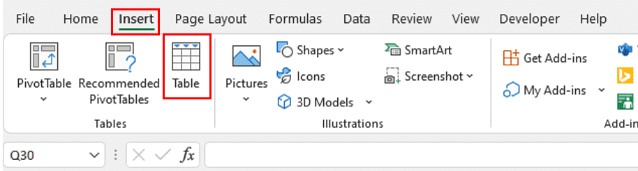
How to Make a 3D Map in Excel
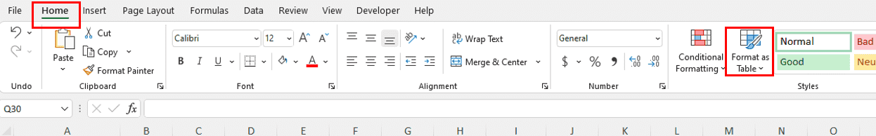
To test it out, we gathered our google analytics data for visits to our Australian site by country and collated it into a simple Excel workbook. For Power Maps to be effective, the geographic data needs to be formatted as so. To do this convert your data to a table (either under the home or data tab).
Then select the data you want classified as geography and navigate to the data tab. Then click on ‘Geography’ under data types.
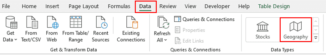
A small map icon should appear in the cell indicating that Excel recognises the location.
![]()
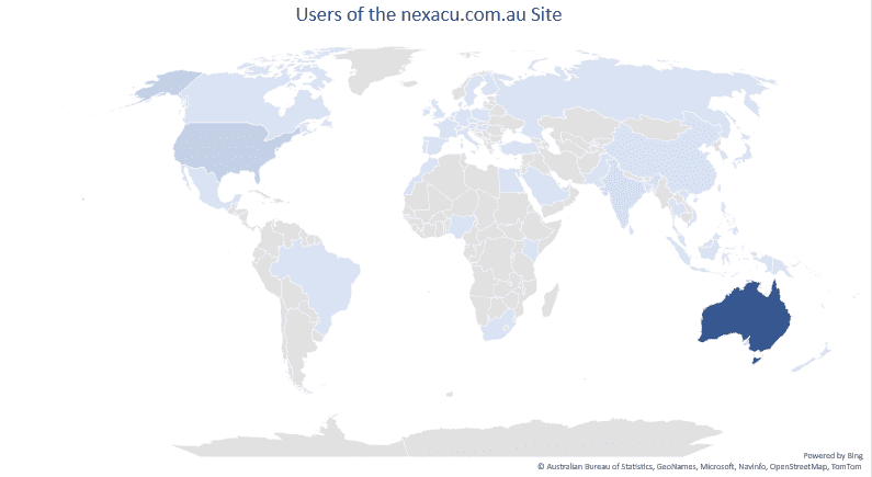
To map the data, select both the geographic and user columns and click on the ‘insert’ tab. Under charts, select the ‘Maps’ option and a map containing your data should appear!

You can alter the map under the ‘Chart Design’ tab.
For more Excel tips and tricks, join our Excel course. Courses are available at a beginner, intermediate, advanced, and expert level.